Traffic doesn’t necessarily equal dollars. Once someone lands on your blog post, you actually need to convert them.
I started my career in the lead-generation industry, and that experience taught me that there are two ways to generate more revenue from a blog post:
- Increase the number of visitors to your blog post
- Increase the conversion rate
Ideally, we want to do both of these things.
Conversion rate optimization (CRO) is the process of increasing the number and quality of conversions on your webpage. You’ll use a call to action (CTA) to convert a visitor from a reader to a conversion.
It is worth mentioning that conversions aren’t always revenue, at least not initially. For companies with sales-led go-to-market strategies, a conversion might be something pre-revenue, like an email collection or a demo booked.
Having published thousands of blog posts and driven many millions of dollars in revenue from blog posts, I can tell you that optimizing your blog posts for conversion takes some trial and error, but it is time well spent.
This article will highlight a few tactics to increase the number of CTA clicks and conversions you drive from your blog content.
Implement a CTA on the Sidebar
Let’s start with some low-hanging fruit.
You could implement a call to action (CTA) on your blog's sidebar. For example, LogRocket has a nice CTA that falls below their table of contents:
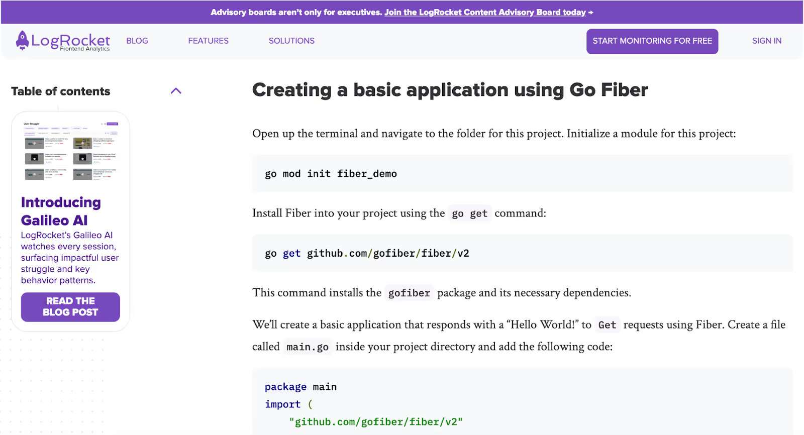
I like this example because the CTA follows the reader throughout the piece of content. In this case, LogRocket is actually pushing users to a product update-style blog post.
These CTAs are great because they are very natural and will not disrupt the reader as they read the blog post. Depending on your CMS, you might be able to dynamically switch the sidebar CTA depending on the funnel stage the blog post falls into.
This CTA is in addition to two other CTAs that LogRocket displays as the user scrolls through the page. For example, LogRocket has more direct CTAs at the top of its pages: one to get started with its product and another to join its advisory board.
Drop CTAs Throughout the Article
Before starting Positional, I built what became a very large blog in the Kubernetes industry. We created many in-depth tutorials and guides that fit squarely into that middle section of the funnel, where a potential customer had an issue but didn’t know they could use our toolset to help them.
In that middle section of the funnel, I’ve found that in-text CTAs can be very effective. Throughout our tutorials, we would drop our own ad blocks directly into the page:
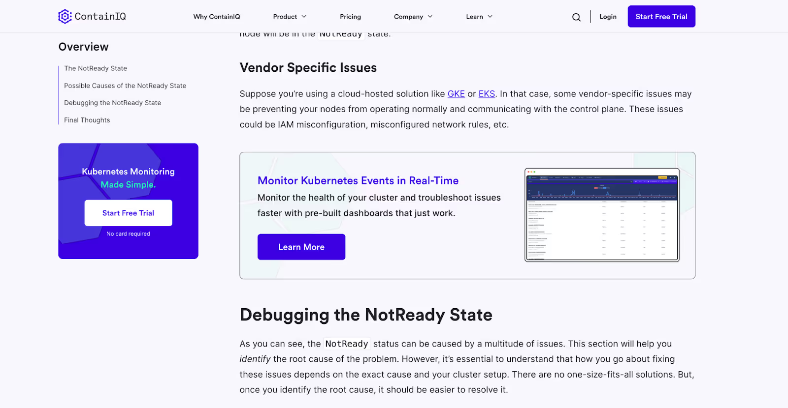
We worked hard to personalize these ad blocks to the page that the user was currently viewing, and we provided a screenshot of our product that could help them solve the issue they were experiencing.
You’ll want to be careful not to make these ad blocks too disruptive for the reader. You’ll want to make sure that they are easy to scroll past and on-brand with the aesthetic of the rest of your website.
As you can see, we also had a host of additional CTAs alongside the sidebar and at the top of our menu navigation, where the user can sign up for our weekly newsletter or get started with our product directly.
I’ve seen companies successfully promote downloadable content within these in-text CTA blocks, too, if you don’t necessarily want to push a reader directly into a sign-up flow right now. You could even implement an email collection for downloadable content directly into the CTA block without forcing the user to leave the page.
Experiment with Pop-ups at the Bottom of the Screen
Whenever I’m looking for CTA inspiration, I love looking at blog posts from companies in the lead-generation business.
Nerdwallet, one of the largest lead-generators in the financial services space, has a very large content marketing strategy.
While NerdWallet displays many CTAs throughout their blog pages, I like how they implement a pop-up CTA at the bottom of each blog post:
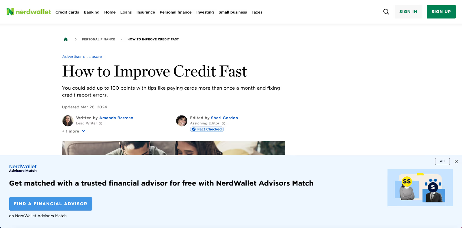
The CTA overlays the webpage and follows the reader as they scroll. It is clear and incorporates professional-looking graphics, making it easy for the reader to click off the pop-up if they like.
Exit-Pops Are Worth a Try
I know that not everyone loves exit pop-ups, but they can be fairly effective, and you might have nothing to lose. At my first company, we had an exit pop-up on a single blog page that drove about $5,000 a month in revenue.
An exit-pop is a popup that displays when the reader is about to leave your blog post, or when their cursor moves to the top of the browser window.
OptinMonster, a company in the pop-up space, fires these exit pop-ups when you try to leave one of their blog posts:

They’ve actually got two different exit pop-ups firing here. The first, at the top, is a CTA to subscribe to and get notified when they publish new blog posts. The second is more direct, offering a promotional deal if you start with their product today.
I like how both of these pop-ups are on brand. It is relatively easy to click out of them simply by clicking outside of the pop-up box. This is important if you implement exit pop-ups or pop-ups of any kind. Make sure that it is easy for the reader to click out of them.
There are other types of pop-ups, too. For example, you could trigger a pop-up based on a certain scroll depth or the amount of time spent on the blog post.
Drop a CTA at the Bottom
Of course, you can drop a CTA at the very bottom of your webpage, too.
MailChimp, a leader in the email newsletter industry, drops CTAs at the bottom of each of their blog posts:

And Monday.com, a popular tool for project management, has these nice-looking CTAs placed at the bottom of their pages, right below the FAQs section:
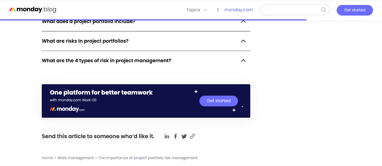
Monday also has a CTA asking readers to share the blog post on social media. I’ve experimented with these social CTAs in the past but haven’t found much success, although I’m sure it varies pretty dramatically depending on your industry.
Work Your CTAs Naturally Into the Blog Itself
Depending on the blog post’s topic, you might be able to weave your products or services naturally into the text.
For example, on our blog, we actively create content about different content marketing and SEO techniques; often, our toolsets might be directly helpful in facilitating that work.
For example, in our blog post about keyword difficulty, we took a screenshot directly from our platform highlighting the keyword difficulty of a keyword:

We also mention a few competitive products, which are controversial from a conversion standpoint. However, mentioning competitive products in this context is actually more helpful for the reader.
For example, in this blog post about dwell time, we highlight our Content Analytics toolset towards the end of the article, mentioning it as a toolset that helps monitor user-experience metrics (see what I just did there):
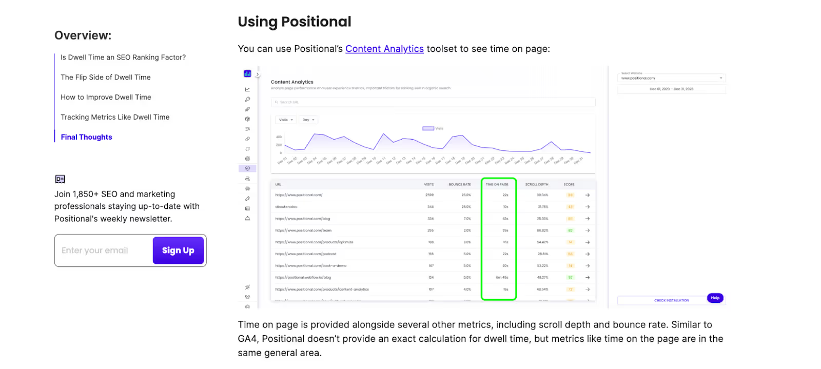
Suppose you mention your products and services directly in your blog posts, especially if those blog posts serve evergreen topics. In that case, you’ll want to be careful to ensure that your content isn’t overly promotional and that it provides the reader with the information they might be looking for.
However, if the blog content serves the bottom portion of your funnel, being a little more aggressive with in-text plugs and mentions makes sense.
Align the Ask to the Stage of the Funnel
As just a quick piece of advice, make sure that your CTAs and the copy you are using on them align with the stage of the funnel that your blog post and your sales motion.
If you are driving traffic to a very evergreen blog post about, let’s say, “What is email marketing?” a direct CTA to sign up for your product might not be as effective as one asking readers to sign up for your newsletter to receive email marketing tips and advice.
On the other hand, if your blog post is at the bottom of the funnel and your reader could reasonably buy your product right now, a direct CTA to get started or book a demo will be more effective than a CTA asking them to download a white paper.
Focus on Keywords at the Bottom of the Funnel
Conversion rates and the number of clicks on your CTAs will vary dramatically.
If you are pursuing search engine optimization (SEO) to acquire new readers for your blog, I’d encourage you to spend a little more time thinking about the bottom of the funnel.
There are many different types of BoFu keywords and pieces of content to create, including comparison pages, best-ofs pages, and so much more.
These pages often generate many more CTA clicks, and you will be closer to revenue in the conversion cycle.
Tracking Conversions and CTA Clicks
Fortunately, there are many ways to track your blog's conversions and CTA clicks. Tools like Google Analytics allow you to set and track clicks to different web page elements. Tools like HubSpot will enable you to track website visitors and their actions, all the way into the CRM.
I like to track CTA clicks on a page-by-page basis, but I’ve also found it helpful to group or bunch CTA clicks and report on a funnel basis.
Ultimately, I’ve found the most helpful metric to be value per page session over the long run. Essentially, you can calculate the revenue value of each CTA click and monitor the value or expected revenue that each blog post on your website provides over time.
Final Thoughts
Odds are that you should just be using more CTAs on your blog pages. Most companies don’t use enough.
There are many different types of CTAs to consider implementing; for example, CTAs can be woven naturally into your content, pop-ups, and web page navigational elements.
It will take some work to test different CTA copies and placements, and you’ll want proper tracking to monitor the results.
.avif)


